Data Basics
This chapter kicks off the foundational building blocks of a data science pipeline. We start by taking a closer look at data itself. Understanding different attribute types is crucial for choosing appropriate visualizations, preprocessing techniques and machine learning algorithms.
Create a new project
- For this chapter create a new project. Revisit the wrap-up section from the setup guide.
- Install the packages
seabornandpandas
Tabular Data
Throughout this course, we will primarily work with tabular data, simply think of spreadsheets. Tabular data is organized in a rectangular format with:
- Rows: Individual observations or samples (e.g., one student)
- Columns: Attributes or features describing each observation (e.g., name, age, average grade)
| Name | Age | Average Grade |
|---|---|---|
| Claudia | 19 | 1.45 |
| Stefan | 22 | 3.4 |
| Max | 20 | 2.12 |
Each row represents one student, while each column contains a specific attribute about that student.
Understanding the structure of tabular data is essential because most machine learning algorithms expect data in this format. Now let's explore what types of information each column can contain.
Attribute Types
Not all data is created equal. The type of data in each column determines what operations we can perform and which visualizations make sense. We distinguish between two main categories: numerical and categorical data.
Numerical (Quantitative)
Numerical data represents measurable quantities, i.e., values you can perform mathematical operations on.
import pandas as pd

temperatures = pd.Series([22.5, 18.3, 25.1, 19.8, 23.4])

print(f"Average temperature: {temperatures.mean()}°C")
print(f"Maximum temperature: {temperatures.max()}°C")
Numerical data comes in two types:
Continuous: Can take any value within a range, including decimals. Examples include temperature (22.5°C), body mass (3750.5g) or height (1.75m).
Discrete: Can only take specific, countable values, typically integers. Examples include number of students (5) or age (22).
Tip
A simple rule of thumb: If you can meaningfully have fractional values, it's continuous. If counting whole units makes more sense, it's discrete.
Numbers aren't always numerical data
Just because data is stored as numbers doesn't make it numerical. Consider ZIP codes, their mean is mathematically possible but conceptually meaningless.
zip_codes = pd.Series([6020, 1050, 6011, 1010])
print(f"Average ZIP code: {zip_codes.mean()}")  # Makes no sense!
If you can't meaningfully add, subtract or average the values, it's categorical data in disguise.
Other examples are customer IDs or coordinates.
Categorical (Qualitative)
Categorical data represents qualities or characteristics that place observations into groups or categories.
colors = pd.Series(["red", "blue", "green", "red", "yellow"])

print(f"Unique colors: {colors.nunique()}")
print(f"Most common: {colors.mode().squeeze()}")  # (1)!
- The
mode()method returns apd.Serieswith a single value, hence wesqueeze()the value.
Categorical data can be further divided into two types:
Nominal
Nominal data has no inherent order, the categories are just different names or labels. Examples include colors or country names.
Ordinal
Ordinal data has a meaningful order or ranking between categories, but the distance between categories isn't necessarily equal. Examples include t-shirt sizes (XS, S, M, L, XL) or education levels (High School, Bachelor's, Master's, PhD).
Now that we understand different data types, let's see them in action with real data.
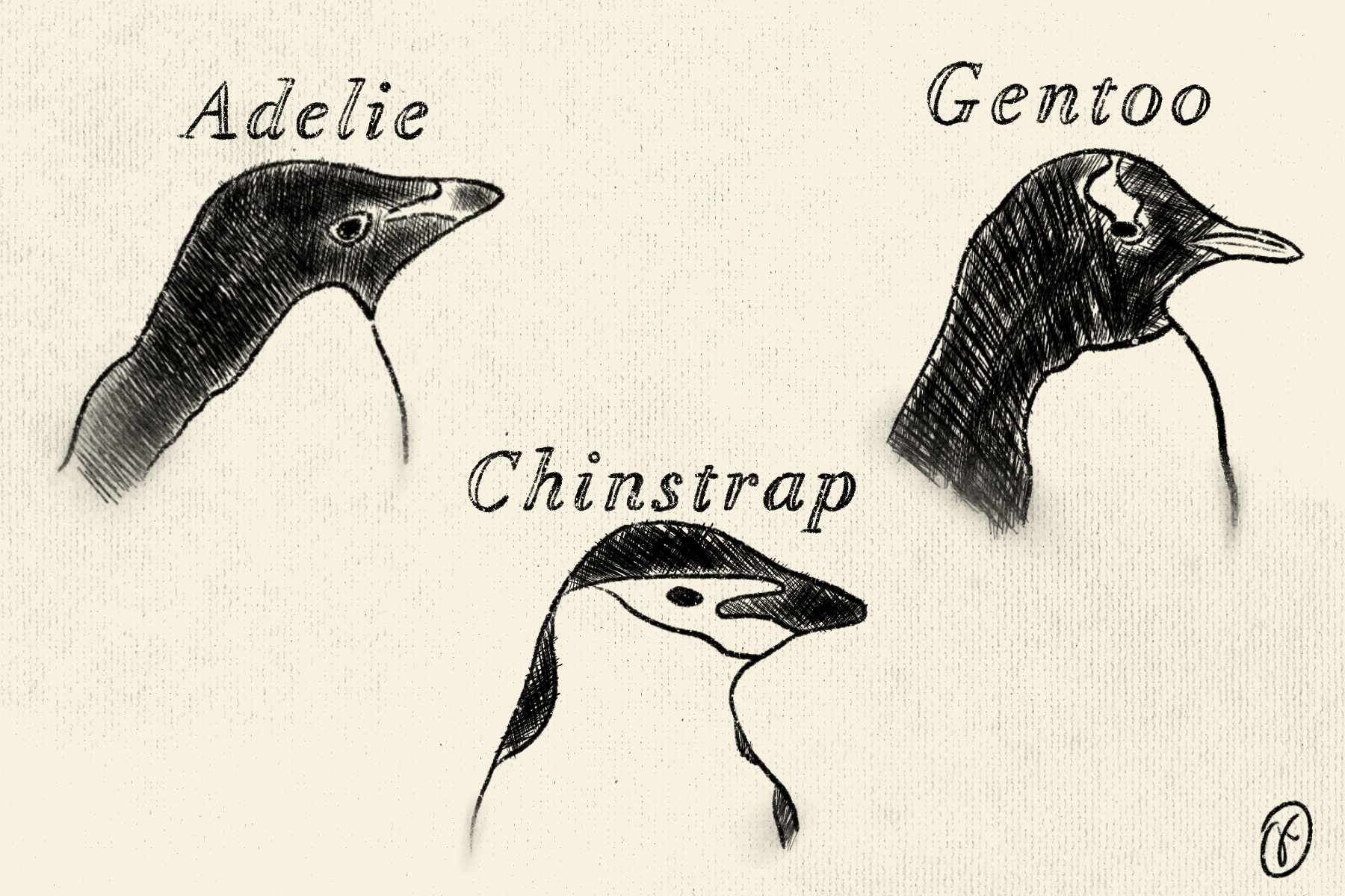
Penguins
We'll use the Palmer Penguins dataset, which contains measurements of three penguin species observed on islands in the Palmer Archipelago, Antarctica.
Info
The Palmer Penguins dataset was collected and made available by Dr. Kristen Gorman and the Palmer Station, Antarctica LTER.1 It's become a popular dataset for education.
Loading the Data
Let's load the penguins dataset and explore its structure.
How many rows and columns has the penguin dataset?
Identify attribute types
Looking at the dataset, can you identify which attributes are:
- Numerical?
- Categorical?
Numerical attributes
The dataset contains several numerical measurements. Let's focus on
"body_mass_g" as our primary example. Easily get basic statistics
with the describe() method:
count     342.000000
mean     4201.754386
std       801.954536
min      2700.000000
25%      3550.000000
50%      4050.000000
75%      4750.000000
max      6300.000000
Name: body_mass_g, dtype: float64
The mean body mass is roughly 4200g (about 4.2kg or 9.3 pounds), with values ranging from 2700g to 6300g. This variation is quite substantial, the heaviest penguins are more than twice the weight of the lightest ones! The standard deviation of 802g indicates considerable variability in penguin sizes.
Missing values
You might wonder why the count is 342. There are two missing values within
"body_mass_g", resulting again in 344 penguins.
For now, we don't worry about missing values as pandas excludes them when
applying methods such as the describe() method above. The subsequent chapters
will dive into missing values.
Categorical attributes
For categorical attributes, let's examine "sex". Just like with
numerical attributes, we can apply the describe() method.
Notice how pandas automatically infers the data type and calculates appropriate metrics. Unlike numerical data, calculating mean, min or max would be meaningless for categorical data.
Visualizing different attribute types
A key component of data science is visualization, which helps us understand patterns and distributions in our data. Different attribute types require different visualization approaches.
Numerical
For numerical attributes like "body_mass_g", we can create a boxplot
which shows the median, quartiles and outliers.
Plotting with pandas
Both pandas.DataFrame and pandas.Series objects have a built-in plot()
method that provides quick access to various plot types. Check out the
documentation for
DataFrame.plot()
and
Series.plot()
to see which plots are supported via the kind argument.

For numerical data, other suitable plots include histograms
(kind="hist") for showing distribution patterns, or scatter plots
(kind="scatter") for revealing relationships between two numerical
variables (like "flipper_length_mm" vs. "body_mass_g").
Categorical
For categorical data like penguin "sex", a bar chart or pie chart
displays the frequency of each category.
# first, we need the counts of each category (male, female)
counts = penguins["sex"].value_counts()
counts.plot(kind="pie")
plt.show()

The visualization reveals that male and female penguins are nearly equally distributed in the dataset.
Choosing the right plot for categorical data
While pie charts work well for showing proportions, bar charts are often
preferred when comparing more than 3-4 categories or when precise comparison of
values is important. Try kind="bar" to see the difference!
Exercises
Exercise 1: Explore bill length
- Calculate basic statistics for
"bill_length_mm" - Create a histogram to visualize its distribution
What's the median bill length? Do you notice any patterns?
Exercise 2: Island distribution
- Count how many penguins were observed on each island
- Create a bar chart showing the distribution
Which island has the most penguin observations?
Recap
In this chapter, we established the foundation for understanding data:
- Tabular data organizes information in rows (observations) and columns (attributes/features)
- Numerical data represents measurable quantities (continuous or discrete)
- Categorical data represents groups or categories (nominal or ordinal)
- Different data types require different visualization approaches
Further Reading
Expand your knowledge with these related topics:
- Plotting Guide: Learn to configure plots, add styling, titles and customize visualizations
- Distributions: Dive deeper into statistical distributions and advanced visualization techniques
- Pandas Documentation: Comprehensive guide to data manipulation with pandas
-
Horst AM, Hill AP, Gorman KB (2020). palmerpenguins: Palmer Archipelago (Antarctica) penguin data. R package version 0.1.0. https://allisonhorst.github.io/palmerpenguins/. doi: 10.5281/zenodo.3960218. ↩